

TransBuzz
Redesigning the Georgia Tech transportation app
Project Overview
Using design to improve the student experience at Georgia Tech
During a 10-week UI/UX design bootcamp through Bits of Good - an organization at Georgia Tech focused on creating software for local nonprofits - my partner and I decided to improve the current bus app, TransLoc, for our end-of-bootcamp project.
TIMELINE
TEAM
Ethan Zhao
Emmaly Nguyen
ROLE
TOOLS
Figma
Context
What is TransLoc?
TransLoc is Georgia Tech's primary bus tracking app and is used by thousands of students daily. Additionally, Georgia Tech also provides a demand-response, shared-ride transportation service for Georgia Tech students on a separate app called GT Stingerette.
Problem
Students are unhappy with the TransLoc app
Now the third bus app in three years, TransLoc, an unpopular app amongst students, forces users to relearn what is supposed to be a reliable transportation app. The app has flaws within its transportation integrations and visual design. And its lack of consolidation between the bus system and the Stingerette system alongside a confusing layout creates a difficult and poor user experience.
Solution
To help users navigate campus more easily, my partner and I redesigned the TransLoc app as TransBuzz, making it more visually engaging and informative. We prioritized important ride details, removed unnecessary clutter, and streamlined campus transportation by integrating the bus and Stingerette services into one app.
User Research
Identifying key requirements
The research we conducted was through four in-person interviews. To understand how users interacted with TransLoc, we focused our interview questions on three goals:
1. Identify how students navigate in and between the transportation apps.
2. Find out what features are most useful to students.
3. Determine what features could be improved and how.
Findings
Three main themes:
After interviewing our participants, we sorted their responses with affinity mapping to help visualize and group our findings.
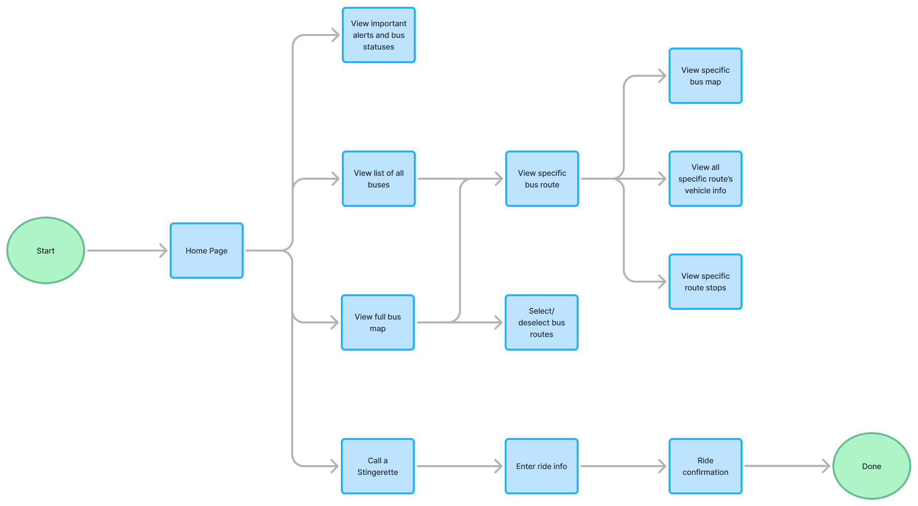
User Flow
Creating a general structure and layout
To address the pain points from our user research, we focused our redesign on a streamlined display of information, a direct notification system to improve communication with users, and the integration of Stingerette services.
With this in mind, we created a basic user flow that would incorporate three main pages: a Home Page, a Bus Page, and a Stingerette Page. We used this user flow to inform the rest of the app's information architecture.
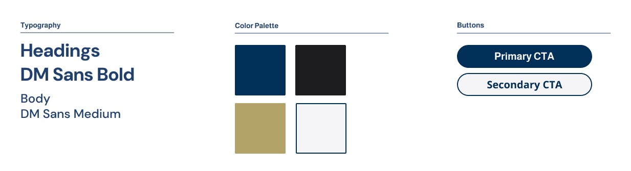
Style Guide
Prioritizing familiarity and simplicity
In creating an identity for TransBuzz, we chose to keep the colors consistent with the Georgia Tech brand identity to ensure familiarity and chose sans-serif fonts to keep the look clean and simple.
Iterations
Designing for the passengers
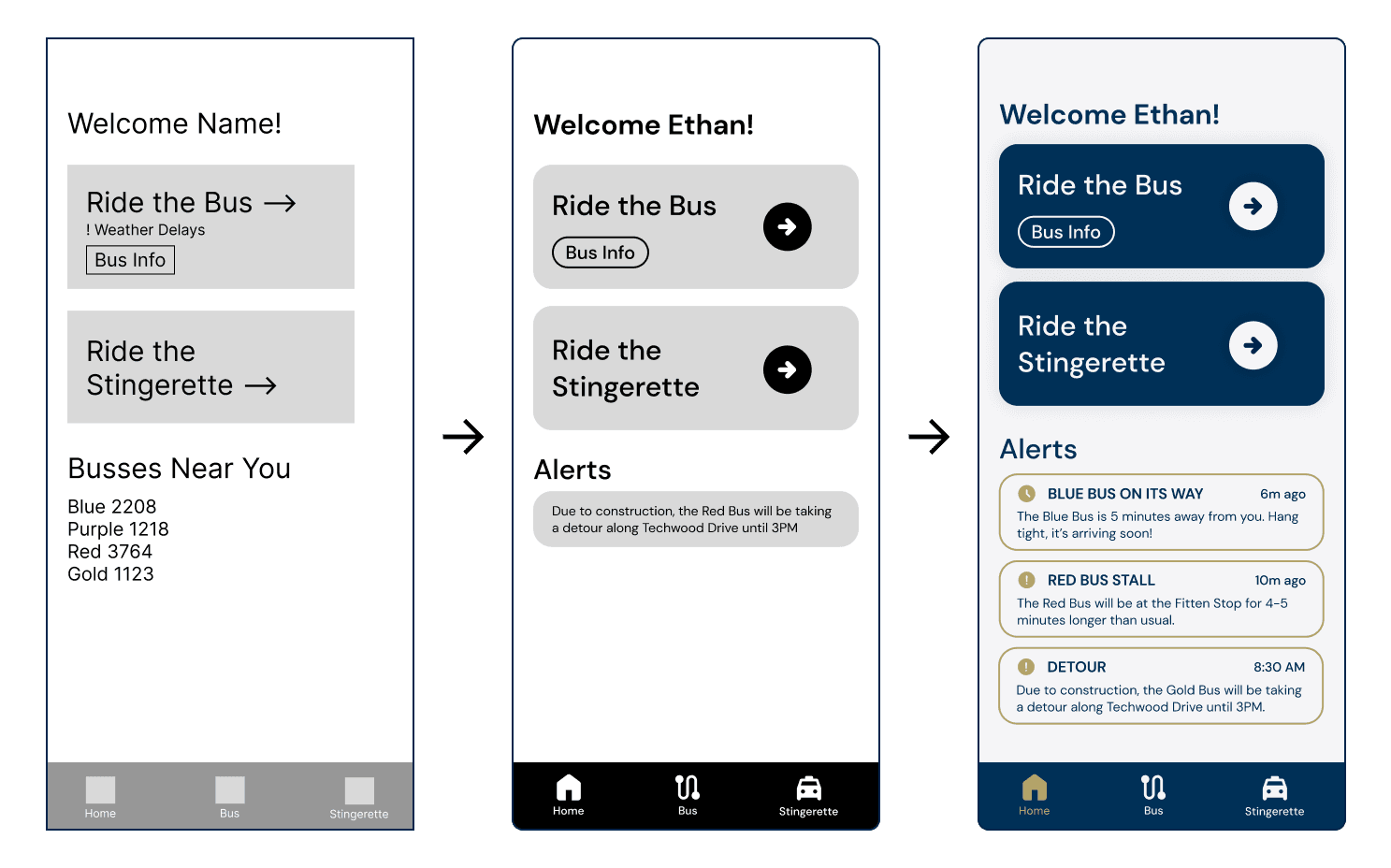
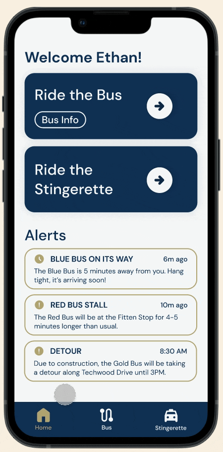
Home Page
We drew inspiration from popular rideshare apps.
The home page aims to display all app functions clearly and intuitively, allowing users to quickly access the specific functions they need.
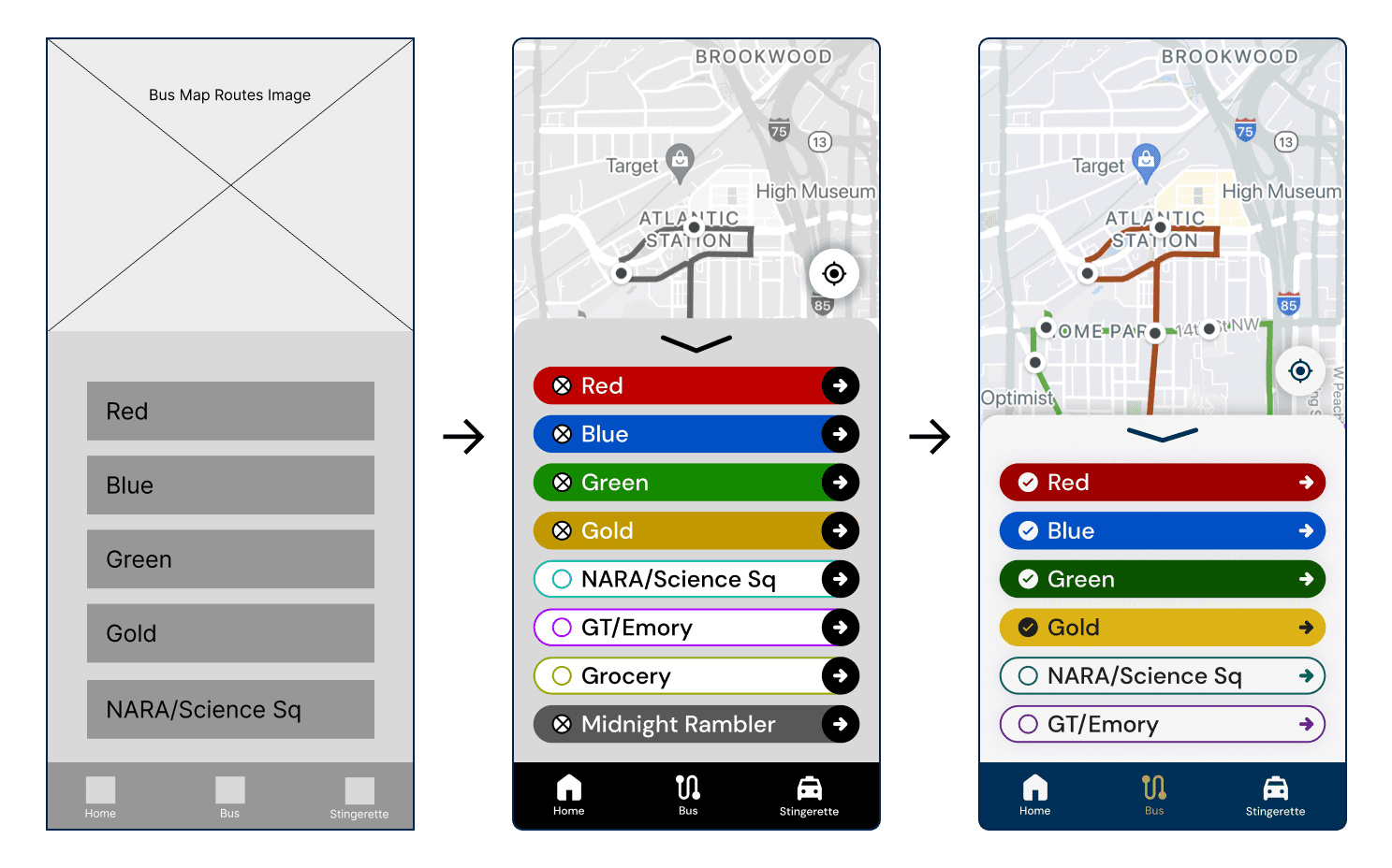
Bus Page
We kept the map consistent to maintain user familiarity, as interviews revealed no issues with its layout.
The improvement lies in removing unnecessary elements, simplifying the design, and enhancing text size and contrast for better readability.
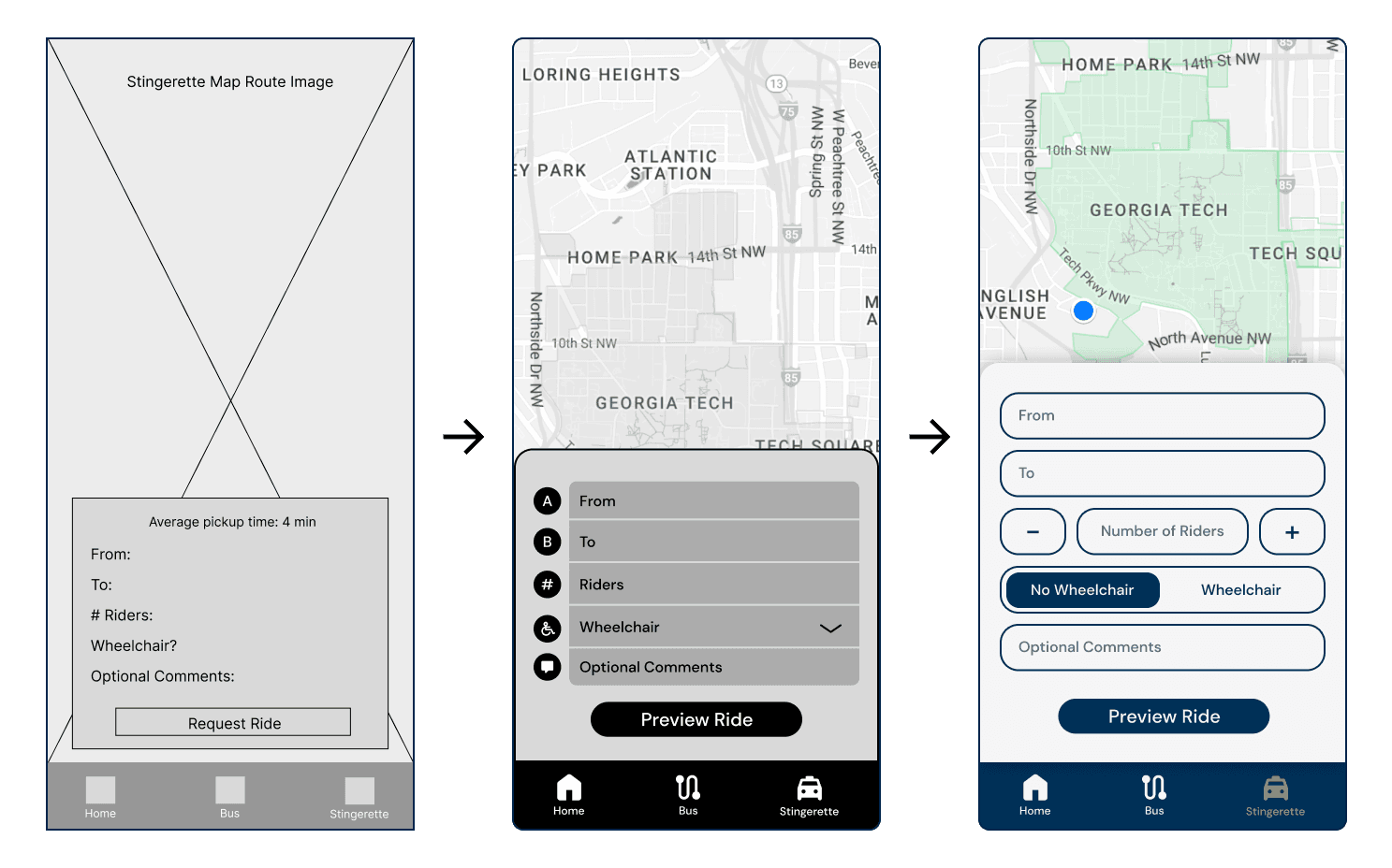
Stingerette Page
This page posed a great challenge. Balancing simplicity with all the required inputs without cluttering screen space was not easy.
In the end, we decided the best solution was a bottom popup for instructions to allow users to easily keep track of all of their transportation information.
Final Deliverable
Arriving at the final destination!
01
Streamlined home page
Be immediately notified of all important alerts on the landing page
See all transportation options in one hub - users no longer need to open multiple apps to decide what transit option to use
Access all information - route map, route details, bus capacity, vehicle number, break times - for increased efficiency and clarity

02
Back to basics bus page
Be immediately notified of all important alerts on the landing page
See all transportation options in one hub - users no longer need to open multiple apps to decide what transit option to use
Access all information - route map, route details, bus capacity, vehicle number, break times - for increased efficiency and clarity
03
Smoothly integrated Stingerette page
Request a Stingerette ride without going to a separate website or app, reducing confusion
Plan a ride without guessing it may arrive with preview functionality
Stay updated about ride status with the ability to see estimated time of arrival and number of stops ahead.
Reflections
Looking back on the journey and future considerations
Future Steps
Add Accessibility Options
Introduce features like colorblind or high-contrast modes to assist users with visual impairments, ensuring better accessibility for navigating color-coded bus routes.Enhance Alerts
Integrate Stingerette notifications into the Home Page alerts to streamline updates, eliminating the need for SMS or calls and improving access for all users.Expand User Research
With more time, we could refine feedback collection, distribute surveys for concrete data, and conduct deeper interviews to improve research quality.
Reflection
This project was my first UI/UX case study (woohoo!), giving me hands-on experience in problem definition, user research, and interface design. I learned the importance of thorough research for understanding problems and creating effective solutions, guided by encouraging and constructive feedback from our instructors.
Working with my partner, Emmaly, helped me exchange ideas, identify my strengths, and also recognize some areas for improvement, while highlighting the value of clear communication in teamwork. This experience introduced me to UI/UX, deepened my understanding of its processes, and has inspired me to further explore the field.